Microsoft Power BI Tutorial - A simple timesheet dashboard Part 2, calculated columns and measures
Extending my simple timesheeting dashboard so that I could report on staff utilisation by month was a good way to start to use measures in Power BI Desktop. What I wanted to get to was a chart that showed the percentage of each person's time being spent on chargeable work each month.
Measures are DAX expressions that perform calculations when you interact with your data. They're not the same as calculated columns and to the complete novice they may be a little harder to understand.
I'd already used calculated columns to show total days worked in a month rather total hours. Calculated columns are easy to understand - you create a new column on a table in your data model and use a calculation to create a value for each row in the column.
For example, working out Days from Hours timesheeted. For every row in the Timesheet Data table we take the Hours worked and divide by our standard working day - 7.5 hours:
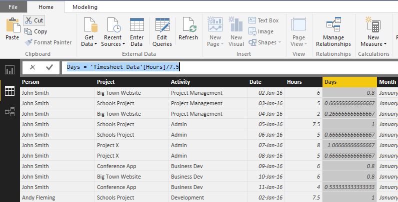
The end result is a new column with a calculated value in each row. With a calculated column the calculation happens at table level before we do any interaction with reports/dashboards.
Measures are a bit different. The thing to remember about measures - what makes them different from simple calculated columns - is that measures are calculated after we filter or aggregate rows.
This is how I used measures to show staff utilisation by month. The first step was to extend my underlying sample data (I’m working from a simple Excel sheet). I added two new columns - Month and Billable?
My approach then was to create three measures. With hindsight I could have done the whole thing with one measure but I built it up a step at a time and 3 separate measures gave me other ways of showing the data on different visualizations.
-
I created a 'Billable Hours' measure - it uses SUMX() to sum up all the Hours where Billable? is set to True:
Billable Hours = SUMX(FILTER('Timesheet Data', 'Timesheet Data'[Billable?]=True),[Hours]) -
I created an 'Unbillable Hours' measure - the same measure again except this time we sum up Hours worked where Billable? is set to False.
Unbillable Hours = SUMX(FILTER('Timesheet Data', 'Timesheet Data'[Billable?]=FALSE()),[Hours]) -
Finally I used the first two measures to create a new 'Utilisation' measure - it simply calculates the Utilisation as the percentage of billable hours out of the total hours timesheeted:
Utilisation = ('Timesheet Data'[Billable Hours]/('Timesheet Data'[Unbillable Hours] + 'Timesheet Data'[Billable Hours]))*100
I could then use the new measures on the Timesheet Data table to create an interactive view of utilisation by Person and Month.
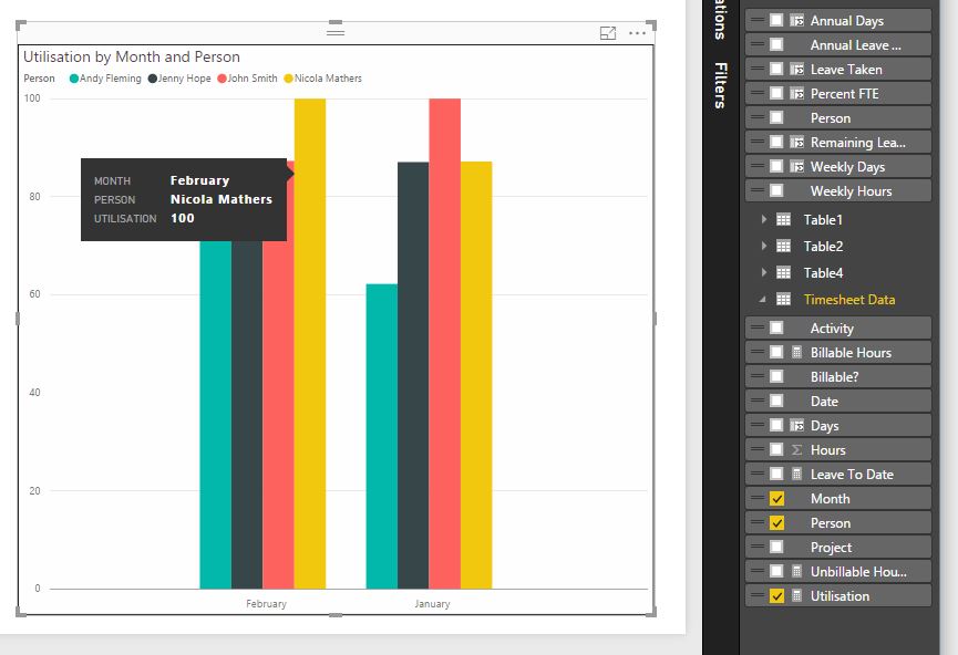
Again, it's worth restating what happens with the measures - they get calculated each time we interact with a report visualization. When we aggregate all the rows for a particular month or person the measure is calculated. Measures are particularly useful when you want sum up, average or count sets of rows.