Microsoft Power BI Tutorial - A simple timesheet dashboard Part 1
Power BI is Microsoft's powerful new data analytics and visualisation solution. Power BI comes in two parts - a cloud based service that makes it easy to share dashboards and Power BI Desktop, a free desktop application for building more sophisticated interactive reports and dashboards. Power BI is low cost - there's a completely free version and the Pro version costs $9.99 per user per month.
A good way to get started with Power BI is to build a first report from some very simple data in an Excel workbook. I used Power BI Desktop (download here) to create a report to analyse timesheet data - the report connects to data about the time worked by different team members on different projects. A simple set of source data means you can focus on understanding how the different data visualizations work and how they connect to the underlying dataset.
The Simple Timesheet Report
Step 1 - Create some data
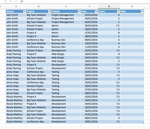
I created a simple list of data in Excel. Power BI Desktop seems happy with data in this 'flat format' and it does like you to format the list as a 'Table' in Excel - it makes it easier for Power BI to interpret your data. So,
- Enter some data into Excel,
- Highlight it and then do Insert ---> Table.
- Indicate if the table has headers
- And then click Ok.
Step 2 - Getting the data into Power BI Desktop
Getting the data from Excel into Power BI is straightforward.
- Click Get Data on the Home ribbon and then Connect to Excel
- Browse to your Excel file and open it.
- The Navigator dialog lets you select your data. You also get to preview it. Click Load.
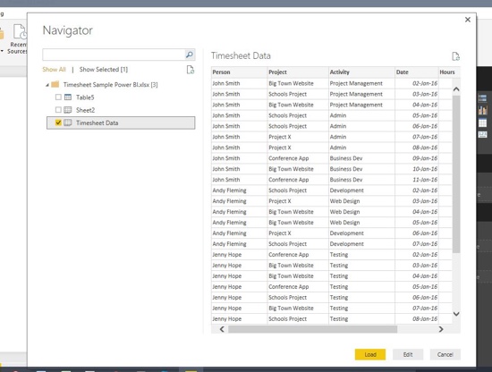
Power BI Desktop now creates a 'model' that holds a copy of your data and details of the connection to original source data in Excel.
Step 3 - Adding a stacked column chart to the dashboard
I clicked the Stacked column chart icon in the Visualizations toolbox. It adds an empty column chart to the dashboard canvas.
The next part took me a little while to work out but again it turned out to be relatively straightforward:
- I clicked Σ Hours under Fields - and Power BI automatically recognises that this field contains the values that I want on the chart's Y-Axis - the total hours worked by each person.
- I also ticked Person and Project - Person becomes the X-Axis, Project becomes the Legend (you can swap these around by dragging them in the Visualizations toolbox).
I now have a column per person and each column shows how that person's time was split across the different projects they worked on.
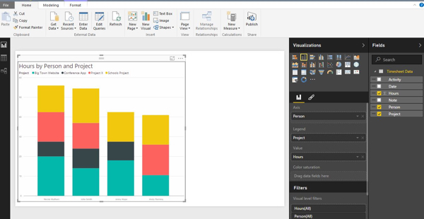
Understanding the difference between 'Value', 'Axis' and 'Legend' in the Visualizations toolbox is they key to working with the different chart types.
Step 4 - Add more visualisations
It's now easy to add more charts to the report. When you start to do that you begin to realise that there is some interactivity built in to the charts. For example, if I click 'Schools Project' in the Pie chart then all the data about the 'Schools Project' is automatically highlighted in the other charts. The colours that belong to the other projects are slightly 'faded out' and the table at the bottom right of the report is filtered to only show me days worked by team members on the Schools Project.
Finally I published my report to the web. It's pretty much just one click - assuming you've registered for the free version of the Power BI cloud service. Clicking 'Publish' pushes the model up to the web and I can view the report in my browser. I can also choose to share it with the rest of the web - I can get some html that I can embed in any website to create the interactive version of the report you see at the top of this post.